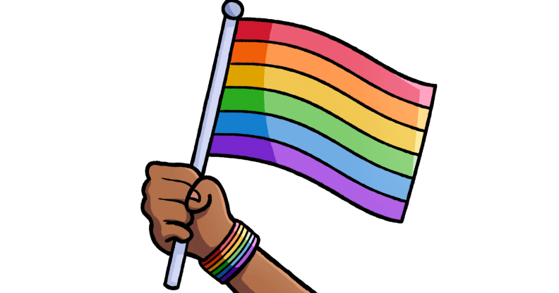
Did Google’s G just get… gayer?

Google has revamped is entire logo and brand identity – but putting its rainbow colours front and centre is causing some confusion on the internet.
The internet giant unveiled a redesign for its graphic this week, refreshing the iconic ‘Google’ lettering and introducing something more friendly and inviting.

It also changed the icon that appears on browser tabs – binning the lowercase white ‘g’ on a blue background, and introducing an uppercase rainbow ‘G’ – featuring red, yellow, green, and blue.

Though the colourful redesign has been welcomed by some – the new colours are definitely causing a lot of confusion on the internet.
Is it a gay gossip site?


A gay bar?

A celebration of equality?


A sinister evil corporation trying to take over the world? OPINION REDACTED

It’s probably just a G in rainbow colours, to be honest.
..but when a company as big as Google changes anything, of course the ENTIRE internet gets involved…

Okay, that’s a lot of–

Oh. Right.
Confusion aside, Google is not afraid to show its support for equality – putting aside its differences with tech rivals Apple, Microsoft and Facebook to submit a brief to the US Supreme Court earlier this year, helping make the case for equal marriage.
The company also released an ad during Pride Month, focussing partly on a trans man, Jake, who talks about his childhood and growing up with gender dysphoria.

