Headless women keep featuring on film posters and it’s not okay

“Off with her head!” Are misogynistic film producers being inspired by a phrase uttered by the Queen of Hearts in Alice Adventures in Wonderland when they design their posters?
It would seem so. But the issue of faceless women in Hollywood is sadly nothing new. In 2016 stand-up comedian and singer Marcia Belsky founded the Tumblr blog Headless Women of Hollywood, which highlights various pieces of promotional artwork that depict women’s bodies but refuses to show their faces.
Around the same time, Marcia also started Twitter and Instagram accounts that focus on the same subject. Recently, her discoveries have been trending on social media as more and more movie-lovers pick up on how infuriatingly sexist it is that such posters feature headless women, especially when the movie industry is supposedly championing inclusion and equality louder than ever right now.
More often than not, the shameless concept is used in posters for comedy movies; specifically, comedy movies that centre on male characters. Belsky has previously named and shamed films such as Dirty Grandpa, Staten Island Summer, Hall Pass, Sex Drive and Hot Tub Time Machine.
Even 1984’s Bachelor Party, which stars Tom Hanks as Rick, a nice guy who gets dragged on a wild night-out with his friends, fits the bill. This isn’t a new phenomenon.

Unsurprisingly, the plots for these sorts of films typically revolve around coming-of-age, sex, out-of-control parties and/or the protagonists getting into some kind of debauchery-based trouble. Interestingly though, the Headless Women trope is a technique employed by many horror posters too with Buffy the Vampire Slayer, I Spit On Your Grave, Lesbian Vampire Killers and Rings being just a few notable examples.
Not that it justifies the comedy posters mentioned above, but it can’t help but seem even more inappropriate when the movies these posters are advertising aren’t even about ogling – or picking up –women.
One particularly disturbing movie poster that features a faceless figure is one for body horror sequel The Human Centipede 3. Its stylistic choice is baffling given the franchise’s toe-curling premise as it depicts a naked woman, bent down in what could be interpreted as a seductive pose. Another features a similar shot, only from a different angle, alongside the tagline: “Assume the position.”
There is – quite obviously – NOTHING sexy about The Human Centipede movies and posters like this not only make zero sense when it comes to advertising, they’re also pretty disgusting.
According to Belsky’s website, the pages – which have been nominated for a Shorty Award – aim to bring attention to “the still standard practice of fragmenting, objectifying and dehumanizing the images of women we see in film, television, and advertisement.”

Not only do these types of posters strip the women of their identities and forcibly subject to the male gaze, they also insidiously suggest that opinions, feelings and personalities of women either don’t exist – because we’re all the same anyway, right? – or are of no interest.
Of course, it is possible to partially hide a woman’s face on a movie poster respectfully and still present a sense of who she is – see Warner Bros’ beautiful Wonder Woman images below – but it’s incredibly rare with artwork of this model. It’s usually all about conceptualising that women are not much more than just their bodies; a theory that’s perhaps evidenced most in the artwork for creature features such as Piranha 3D and Shark Night.
Regrettably, it’s not too hard to see what the studios were thinking here. They’re simply demonstrating to certain members of the public that these types of films feature plenty of women in scantily-clad outfits as a way of getting bums in cinema seats come opening weekend. (Sex may sell or so they say, but that doesn’t make it right).

While the trend tends to crop up on promotional material for horrors and bro comedies the most, there are exceptions to the rule. Television shows like Beauty and the Geek and American Horror Story have been known to obscure women in their advertising.
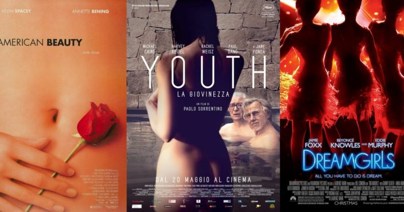
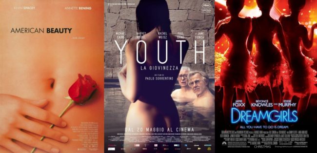
Elsewhere, Oscar-winning drama American Beauty, spy-filled action Kingsman: The Secret Service and musical Dreamgirls all boast unidentifiable women on their posters. Michael Caine-starrer Youth, sports drama A League of Their Own and Paul Thomas Anderson’s Inherent Vice do too.
Heck, even The Matrix Reloaded cut half of Carrie-Anne Moss’s head off in one poster. Although we can’t be too mad at that one, mind. It did do the same for Laurence Fishburne, Hugo Weaving and Keanu Reeves too…
But that’s just pinpoints another reason why Headless Women posters are so lousy… most of the time, they’re done for no reason at all or at the female characters’ expense and they almost never do the same for men on display.
That’s why recent imagery for Marvel superhero outing Deadpool and acclaimed comedy Girls Trip are so effective; they flip the script and make the male character in their posters the anonymous object of desire for a change. (Well, audiences will still know that the merc without a mouth is still the Merc with a Mouth regardless, but you get the point). This design isn’t so great either way but it’s refreshing to see the trope reversed for once.
Thankfully, posters that feature completely headless women seem to be a dying out or at any rate, are getting far less common than they used to be. While that’s partly down to them being out-of-place in our “woke,” more progressive society, it’s also thanks to there being far more female-fronted films being made these days.
Just Google the posters for new movies such as Annihilation, A Wrinkle in Time and Tomb Raider… how nice it is to actually be able to see all those faces!

